KUKBUK.pl – Content personalization portal
- ux workshops
- development
- Product consulting
- UX design
- UI design
- ux strategy
- product discovery
The portal of the cultural and culinary magazine KUKBUK is as seasonal as the cuisine is. The content and appearance of the site change according to the rhythm of the seasons. The site also learns the users' tastes and serves articles tailored to their preferences.

| Customer | Kukbuk Magazine |
| Project | Website & Online Store |
| Deliverables | UX Strategy User Research Usability Testing Project Management Development |
| Project Duration | 6 months |
| Teams | Sparing Digital, Panowie Pro |
What’s the Problem?
Our task was to design and build a portal for a magazine that would be editorially beautiful, texturally interesting and culinary tastes. Our project had to be sophisticated to satisfy the tastes of readers who appreciate high-quality products.
Meeting the goals required ingenuity and thoughtful planning because:
- The existing website lacked modern and effective advertising formats,
- The menu and design of the entire portal were not intuitive to the user,
- Valuable content was poorly visible, thus escaping the attention of internet users.
Our task was also to prepare an administrator panel. It was supposed to facilitate the work of a dozen-person editorial staff of KUKBUK.
Research results
The recipients of KUKBUK content are primarily women aged 25 to 44. Among the users of the existing website they accounted for 59%, on the Facebook profile - 65%, and on Instagram - as many as 80%.
We researched what engages the female audience and what are their expectations from the new portal. On this basis, we formulated a challenge to effectively embed premium quality content that strongly engages, triggers emotions and is memorable.
According to KUKBUK philosophy, food is a statement, a manifesto, and an expression of responsibility. These are values shared by heavy users. So we decided to reflect them in the character of the new portal.

Workshops time
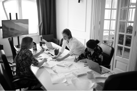
Thanks to the workshops we got to know the problems that the team of enthusiasts creating KUKBUK faces every day. In solving these challenges we were supported by the Panowie Pro team, experienced in developing digital products. This combined expertise allowed us to take care of all the client's needs.
We focused on thoughtful UX, modern design, and intuitiveness - both for the user and for the editorial team itself. We brainstormed the site's modularity and the UX of each functionality.

Prototyping
During the first workshops, we realized that the new KUKBUK portal should be based on widgets. These are modules that can be freely rearranged and filled with content.
Each participant prepared his vision of an intuitive home page and subpages. This is how several different mockups were created. They allowed us to choose the modules that in the opinion of the whole team would be the most useful for the client's team and the most attractive for readers. Together we also created a list of content that required additional visual distinction.
The vision developed during the workshop and all the thoughts of the participants were put together, re-examined and preliminary scope of the portal was created.
UX and design
The beautifully designed magazine demanded excellent visuals online as well. There was no doubt about that. During cyclical meetings with the creators of KUKBUK we discussed ideas and worked together on the visual direction. In this way, we seamlessly combined the team's expectations with our UX recommendations.
The result is a layout that changes according to the seasons. This idea perfectly combines with the seasonality of cuisine promoted by the editorial team. The graphic design was created by Alina Rybacka-Gruszczyńska.

Personalization
For the KUKBUK website we have created a proprietary content personalization mechanism based on the neural network. The portal learns its readers' tastes and serves articles adjusted to their preferences. It is similar to the way Netflix suggests new movies to its users and Spotify suggests music tracks.
Moreover, the portal features recipes based on seasonal ingredients, and the main recipe categories are based on the most frequently searched phrases. We have created a tailored, intuitive content management panel.
Sales and advertising
An integral part of the portal is also an online store. It is a sales channel for paper subscriptions, e-issues and special products. We adjusted the system of advertisements to the character of the magazine. We resigned from pushy promotional forms in favor of native and natural formats.
Kukbuk.pl is an intuitive lifestyle portal full of quality content, based on understanding the user and adapting to his or her needs. The portal has a content personalization system, PWA and the function of flexible adjustment of the layout to the colors of a given season.


Insights
View AllLet us inspire you.
- Case studyVOGUE POLAND: Mobile App
![KUKBUK: Portal]()
- Case studyOPEN'ER FESTIVAL: Mobile application and festival management system
![KUKBUK: Portal]()
- Case studyNUENO: Poland's first digital fashion brand
![KUKBUK: Portal]()


